
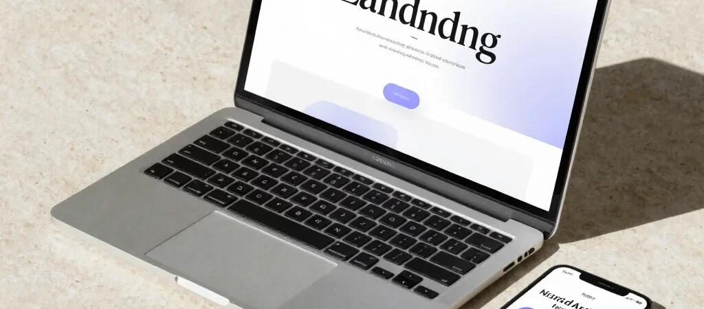
A landing page often gets crowded one reasonable decision at a time: a larger hero image, another button, one more announcement. When you step back, the headline has become just one object among many. Letting typography lead means deciding what the reader should notice first—and giving that message enough room to land.
Give Each Line a Job
Start the hero with one clear headline, a short supporting sentence, and a single primary action. The headline names the offer or point of view; the supporting line adds a useful detail; the button tells the reader what happens next. If two lines make the same promise, cut or rewrite one.
Set the headline width before increasing its size. A narrow measure can make a short phrase feel deliberate, while an overly wide line becomes harder to scan on a laptop and may wrap awkwardly on a phone. Test the actual copy at desktop and mobile widths instead of designing around placeholder text.
Build Contrast Without Noise
A strong hierarchy does not need a different font for every element. Try one expressive display face for the headline and a highly readable sans serif for supporting copy, then use weight, size, and spacing to distinguish navigation and labels. Keep decorative lettering out of small interface text, where clarity matters more than character.
Use colour to reinforce the hierarchy rather than decorate every block. A charcoal headline, quiet grey supporting text, and one violet action can establish a visual route through a white page. Check the text against its background at the size it will actually appear, especially for small labels and button text.
Check the Page in Context
Preview the page on a narrow screen and look for the moments where the rhythm breaks: a headline stranded on one word, a button pushed below the first view, or a paragraph stretched edge to edge. On a mobile connection, large decorative images can also delay the message, so make sure the text remains compelling before every asset has loaded.
A useful test is to hide the imagery and scan only the headings, copy, and actions. If the page still explains what it is and where to go, the typography is doing its job. Add visual detail only when it supports that route.