
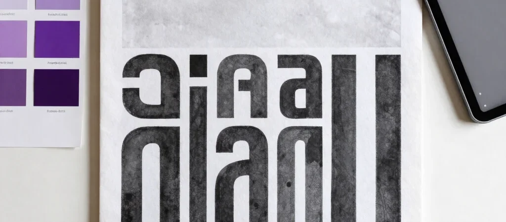
A violet accent looks refined on a colour card, then suddenly takes over when it fills a website header, button, and illustration at once. The fix is not necessarily a paler violet. Build the palette around a useful neutral first, then give violet a specific role.
Choose the Working Neutral
Start with the surface that will carry most of the design: a clean white, a warm off-white, or a deep charcoal. For a bright editorial site, warm white can soften the contrast of screens and printed materials, while charcoal gives small violet accents a more deliberate edge. Choose by testing the neutral beside real images and type, not in isolation.
Add a second neutral for body text or quiet dividers rather than using the main surface colour everywhere. A muted charcoal for text and a pale grey-violet for secondary panels create separation without adding another competing hue. Keep enough contrast for small text to remain easy to read.
Give Violet a Clear Role
Decide whether violet is a navigation cue, a small highlight, or the colour of a particular content category. If it marks links and primary actions, use it consistently so readers learn what it means. A saturated violet can work well in small areas; for larger surfaces, test a lighter tint that does not make the page feel heavy.
Then introduce one supporting colour only if the work needs it. A muted lime or soft apricot can bring energy to a palette, but it should have a defined use—perhaps a chart series or an editorial tag—not appear simply because there is room for one more swatch. Restraint makes the main accent more memorable.
Test the Palette in Layout
Apply the colours to a real interface before calling the palette finished: a headline, a text link, a button, a card, and a small label. Check how the violet behaves beside photography and whether the button still reads clearly on a phone screen. Colour relationships change when type size, image content, and surrounding white space enter the picture.
Write down the palette as roles rather than a row of attractive swatches: page background, primary text, secondary surface, action colour, and optional highlight. That short system is easier to apply across a website, presentation, or brand toolkit—and easier to revise when one colour proves too loud in context.